Alphabet®
The synergy of Minto’s Harmony
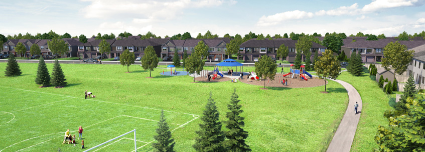
Minto Communities was developing a property to entice young families searching for beautiful, affordable housing to call home.
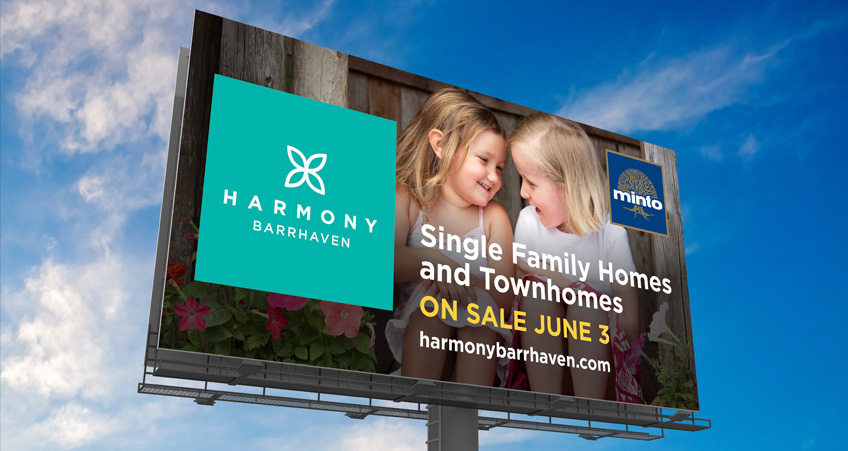
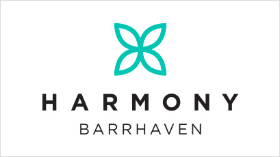
Alphabet® needed to create a community brand that resonated with younger families while promoting inclusivity to align with Barrhaven’s diverse population. The new community was named Harmony.
Our methodology led to the creation of a community moniker synonymous with the coexistence of families from varied cultural backgrounds while reinforcing Minto’s desire for an identifier that instantly represented a sense of belonging, togetherness, and diversity.
A simple, four-pointed shape inspired by the lotus flower in a beautiful teal was the perfect icon to represent both Harmony’s identity, and the connectedness and synergy it stands for.
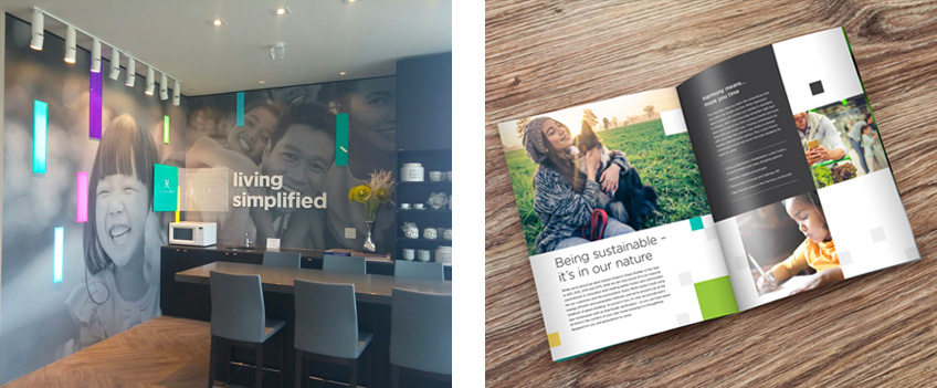
Alphabet® also created a series of engaging environmental graphics to launch the new community brand, ranging from sales centre executions to billboards and community promotional pieces. The end result helped Minto Harmony become so sought after, that all available homes in the first release sold out in a matter of minutes.