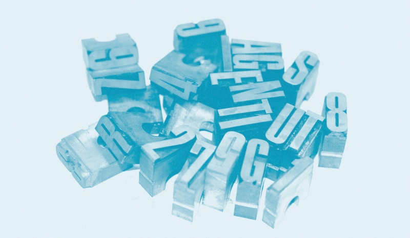
Your logo is the most central element of your brand design. In fact, for many customers, logos represent the proverbial “face” of the company, serving as a key driver of brand recognition. No pressure, right? Well, don’t fret – instead, take a look at some of the most famous logos as a springboard for your own design process.
Noting the commonalities between impactful brand logo designs can help you spot some repeatable formulaic elements. For example, factors like simplicity, memorability, notability, and distinctness all contribute to a standout design.
Effective design communicates brand messaging through presentational elements such as colour schemes, imagery, and typography. Let’s take a closer look at five of the most famous brand logos and see what makes them such hits. These icons offer valuable lessons on how to actively and deliberately use design elements to convey a clear message.
1. IKEA
The IKEA logo exemplifies the concept of simplicity in design while maintaining a strong visual impact. The logo has largely remained the same since 1982, with just small updates to the block font’s spacing and size in 2019 (along with a few other subtle refinements).
The longevity of IKEA’s logo has made the design highly identifiable to customers. That bold blue-and-yellow layout also pays homage to the brand’s Swedish origins, working the brand’s story right into the visuals. Consider too: the design’s simplicity works on a practical level, as it’s easy to reproduce at any size – perfect for a variety of different branding campaigns.
The sturdy build of the typography suggests structural reliability; meanwhile, the simplicity of the layout nods to the brand’s accessible and straightforward approach to furniture. Ultimately, IKEA tops the list of famous logos because of its balance of easy recognizability, simplicity, and clear alignment with brand strategy.
2. McDonald’s
The iconic Golden Arches are known around the globe as a symbol of convenience, consistent quality, affordability, and Big Macs. Many customers find the famous logo comforting, as the fast food chain has emphasized convenience and reliability over the decades. But from a design perspective, it’s the carefully selected colour choice that gives the McDonald’s logo its magic.
McDonald’s chose red and yellow because of research indicating that the colours stimulate hunger – making them ideal for a fast-food chain. Colours have a significant impact on human behaviour, meaning the hues you choose for your logo will engender certain feelings in customers. When considering different schemes, ask yourself what emotions or perceptions you want people to associate with your brand.
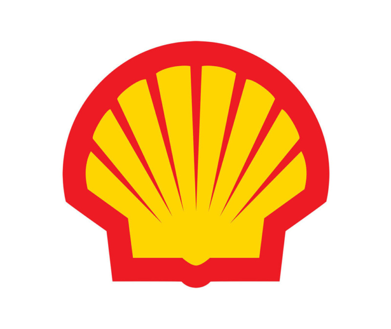
3. Shell
Shell’s logo design goes all the way back to 1904, when founder Marcus Samuel embraced the natural symbology of hidden treasure. The visual equates the preciousness of a hidden pearl with that of the company’s oil. Furthermore, the logo suggests company consciousness regarding environmental concerns, positioning Shell as a responsible industry leader. The symbol also carries positive connotations of energy and innovation – both critical elements of the corporation’s operational function and mission.
This historic example shows the connotations attached to famous logos can make a difference in people’s perceptions of a brand’s development. Shell’s logo also exemplifies the power of consistency. While small details and colours have changed, the central shell imagery has remained the same for well over a hundred years.
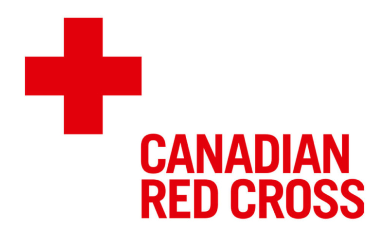
4. Red Cross
The Red Cross is synonymous with humanitarian aid – and the logo reflects this association. The simple yet impactful red cross on a white background was first adopted in Geneva over 150 years ago to represent medical personnel on the battlefield.
An emblem of neutrality, trust, reliability, and care, the logo serves to protect providers and patients by declaring humanitarian values and an uninvolved stance in conflict. Of all these five famous logos, the symbol of the Red Cross best exemplifies the power of association that recognizable imagery possesses.
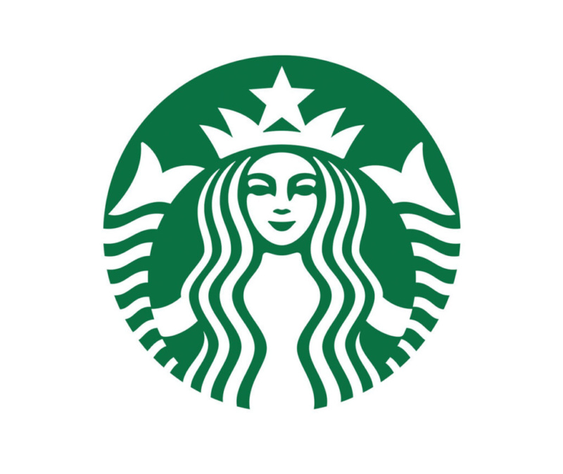
5. Starbucks
Starbucks’ positioning is a great example of luxury brand development, as the company carefully curated an association with quality that has transformed its logo into a status symbol. This generates free marketing from customers as people proudly display cups and tumblers embossed with the logo at work, walking down the street, and in online posts.
The Starbucks logo also benefits from its distinctive design. The company’s long-haired mermaid is more visually complex than the other logos on this list; sometimes, bending the design rules a little works in your favour. This earthy, more antiquated design works with the brand’s messaging, as the company conveys an established and reputable perch in a community-centred industry.
Developing Famous Logos
These five famous logos exemplify the fact that developing a visual identity is a critical component of your brand positioning. The right logo can revitalize your public image and engage new customers—but the wrong imagery can damage your marketing efforts with inconsistent messaging. Ultimately, the best way to ensure the success of your logo design is to work with experts to develop unique imagery for your brand.
Alphabet® has a proven track record of successful brand development and design projects, with clients ranging from a full spectrum of industries. We take a calculated approach to building your brand, combining our years of experience with a careful eye on market trends.
Are you ready to bring out the best of your brand’s identity – and connect with new audiences in the process? Reach out to Alphabet® today—together, we’ll help your brand tell a fresh story.