Most people tend to see themselves as rational thinkers, making decisions grounded in reason. The truth, however, is that most of us act emotionally, the left side of our brains only serving to justify our wants, needs, and impulses.
For marketers, this an important distinction, as the more we can understand emotion, the better we can be at building effective brand experiences. In this regard, colour plays a significant role.
Let’s take a look.
Colour and emotion go hand-in-hand
Colour isn’t just what happens when our eyes and brain partner up to turn light into something pretty. It’s an emotional lever, capable of warming our hearts, cooling our nerves, or even boiling our blood. When used wisely, it can trigger a desired action or attitude.
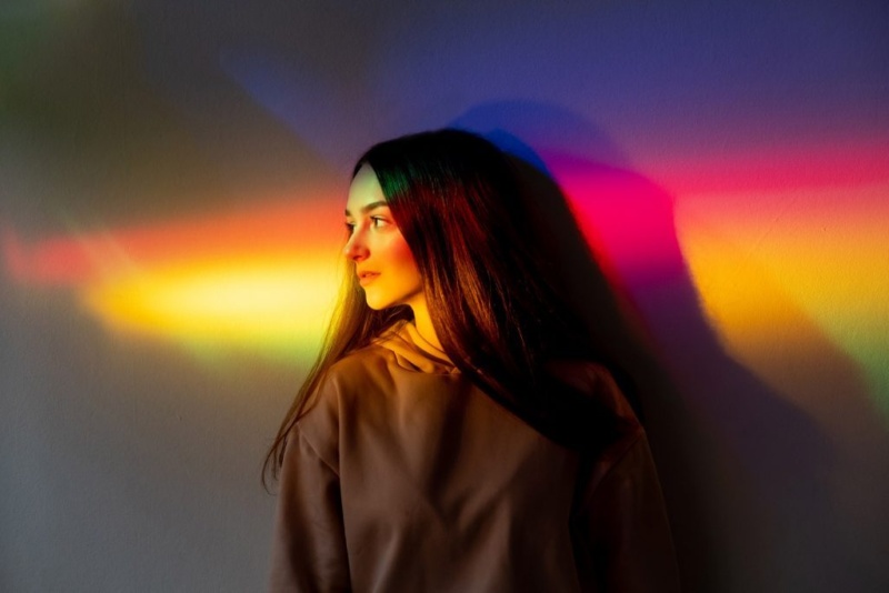
But colour psychology itself – the study of how colours influence our moods and behaviours – isn’t black and white. There are perceptual nuances based on everything from one’s gender and age to personal tastes and upbringing. (Sorry, Inside Out, but blue doesn’t always mean sadness.)
Culture is a big variable, too. Historical, political, linguistic (“I’m so angry I’m seeing red!”) – there are many influences that can impact a person’s perception of a colour depending on their background. As a designer, this is all the more reason to know your audience.
How colour can influence behaviour
If colour is linked to emotion, and emotion plays a role in behaviour, then colour can influence behaviour; in fact, something as simple as changing the colour of a button on your website can be enough to increase clicks.
Let’s look at some of the ways colour is used to encourage an outcome.
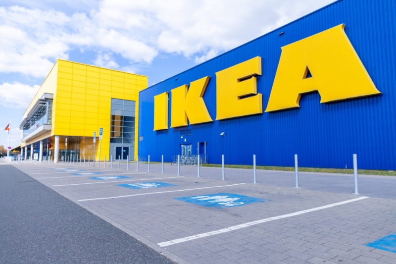
Spatial design
Colour psychology as an element of spatial design isn’t new. It’s used in urban planning, brick-and-mortar stores, and even correctional institutions. It’s frequently employed in restaurant design: dark and warm colours alter our space perception, making dining more intimate, whereas softer, muted hues recede to support a more casual dining experience.
According to colour consultant Laura Perryman, “choosing the right colours and putting them in the right places can help define spaces for different activities.” She argues that bringing earthy tones into a work environment, for example – muted greens, pale yellows, etc. – can boost concentration, wellbeing, and productivity.
The short of it is that colour can be more immersive in a physical environment. When used intentionally, it can paint our subconscious minds to feel or act a certain way.
UX design
Digitally speaking, not only can the right colour palette leave a positive impression in the mind of a user, but it can also be foundational to a positive user experience. What’s more, colour can be used to influence a user’s interactions within a site or app, which can lead to more conversions.

Consider the isolation effect, in which an element that stands out is more likely to be remembered. While there’s no universal colour that cuts above the rest, this is a great principle to apply in directing a user’s attention toward your most salient information. If your website is heavy on grey, for example, your call to action shouldn’t be.
The colourful truth
Research has shown that people form an opinion about a product or environment within 90 seconds. And 62% to 90% of the time, that opinion is based on colour.
More than just a cosmetic device, colour is a tool marketers and designers should be paying fine attention to beyond the visual identity of a brand. It can drive real influence and impact in any number of touchpoints with an audience, from ads and websites to tradeshows and experiential activations.
While there’s no silver bullet to guarantee performance, certain colours are believed to hold certain connotations. Research on this topic is varied, however, but here’s a snapshot of what some sources tend to agree on.
Warm colours
In general, shades of red, orange, and yellow are more arousing, triggering feelings of enthusiasm, passion, energy, or happiness. But, just like they do in the animal world, they can also convey a sense of danger or caution, especially when paired with black (think bees or poisonous frogs).
Cool colours
In general, shades of blue, green, and purple can feel safe, reserved, peaceful, authoritative, mystical, or even luxurious. They can also convey greed, depression, jealousy, or an overtly masculine tone.
Neutral colours
In general, white, grey, black, and shades of brown and beige can be highly functional in elevating bolder accent colours; however, all are viable show-stealers with their own positive and negative associations.
Take it with a grain of (pink) salt.
While colour psychology continues to be a hot topic, research is still limited. As a marketer or designer, the best way to apply the concept is to do your homework then test and refine.
At the very least, it pays to be aware of the many ways a colour can be perceived. In conjunction with your brand personality, knowing your audience will help guide your colour combinations to stand out, evoke emotion, and influence a desired result.