The Art of Hand Lettering
I’ve been doodling as long as I can remember, much to the chagrin of my teachers, professors, and the general public – to all of you, I swear I’m listening.
Somewhere along the line, these doodles became a career path. Digging deeper into the world of design I became fascinated by the form and function of letters and how they interacted with one another. I began filling sheets of paper, napkins, and bits of envelopes with scribbled words and letters.
However, I live and work in a digital world. Most of the things I read, watch or interact with take place on a screen. Despite being in the midst of an era driven by technology; there is still a hunger for the tangible, the authentic, and the creative. This is where digital hand lettering has found its market. Sport and leisure brands, magazines, cookbooks, signage and countless other applications put this technique in high demand.
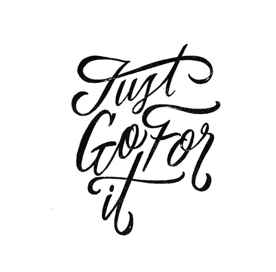
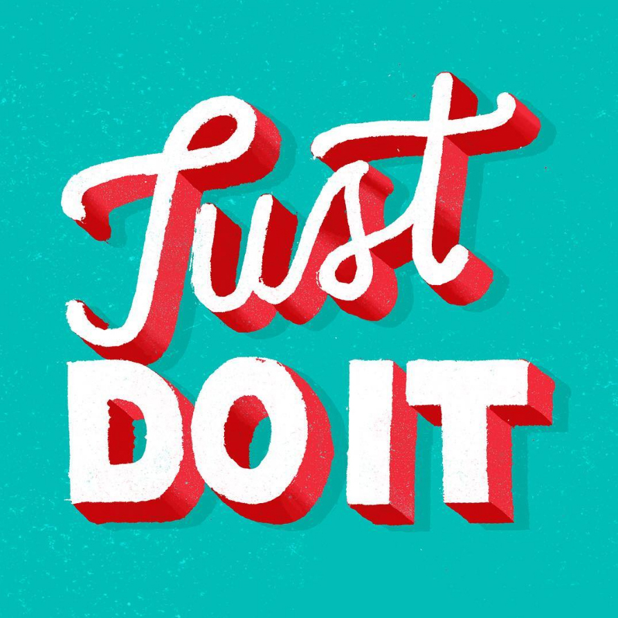
Illustrators and typographers like Dana Tanamachi, Lauren Hom and Jon Contino found success thanks to their unique, unrepeatable style. Sought out for their flair for the unexpected, they created work that evoked emotion, interest and support. Hand lettering is all about creativity, quality and the artist’s ability to interpret and communicate the message with a unique approach. Custom lettering is about using the shapes and forms of words and how they interact with one another to make you feel something. It goes beyond just filling space or picking a font. Each letter is a work of art, flowing into the next; each element carefully considered and supporting the one before and behind it.
In general, the power of typography is significant in that it is the most direct tool for communicating the message and driving a point home. Most often the best typography is the kind you don’t notice, and if you do, it’s probably because there’s something wrong with it.
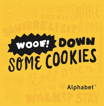
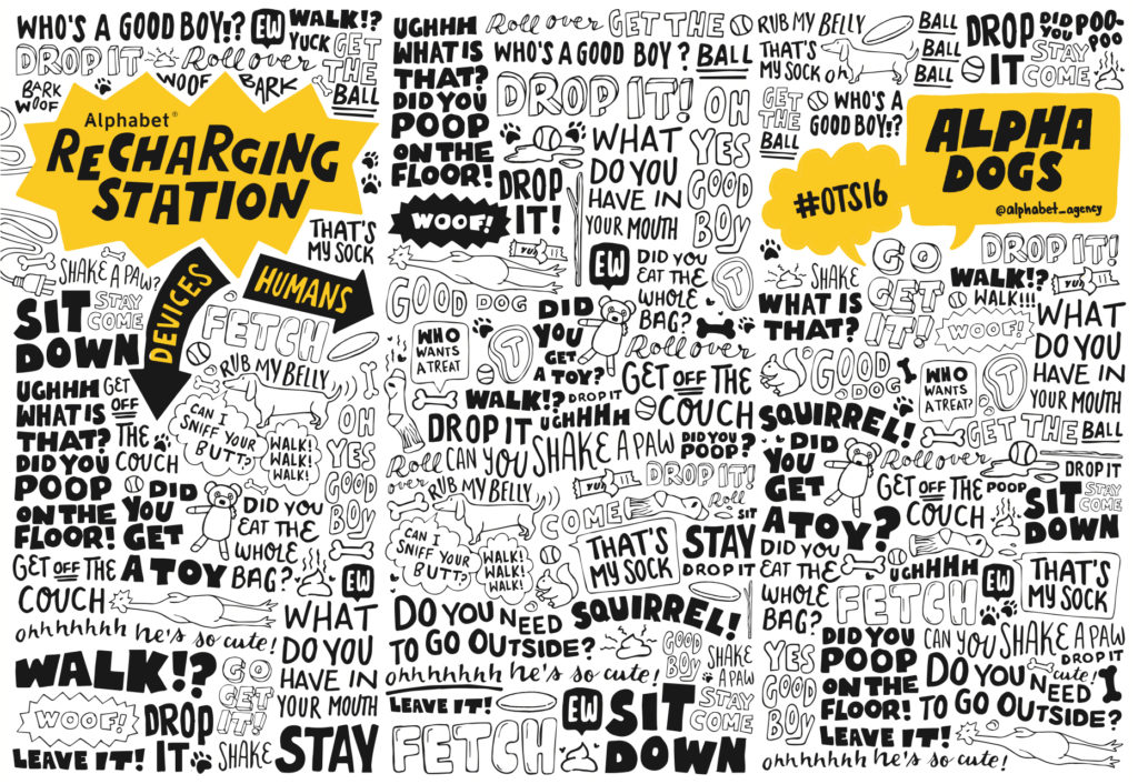
Occasionally though, there are times when the typography is the message, and its form becomes every bit as important as it’s function. In these cases originality and quality are key. The power and authenticity of the form is lost when unique letter forms are repeated excessively.
As the hand made element of design, the “human touch” becomes a more sought after look in design, retailers and companies are searching for a way to cut costs. This has resulted in the birth of fonts and typefaces that have a hand drawn look and feel but are stunted in their diversity of form and character.
While they have their merit – they’re very effective in terms of efficiency and price– they rapidly lose what makes them special when over used. The drawback lies in the uniformity of error. The interest and integrity of the letter forms is lost when the same loop, connecting line or textured shape is repeated too many times. We stop enjoying the overall concept and experience. Instead, we begin picking out patterns and repeated forms, breaking down the actual design until we are no longer enjoying or observing the message or the content as a whole but are tearing it apart piece by piece.

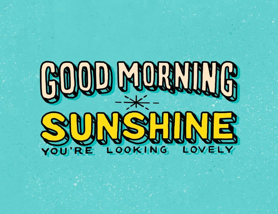
My advice, take the time to create something unique. Something carefully completed, worth sharing, saving or remembering. When you’re good at something it always looks easy, effortless and appears as if it could quickly be repeated or replicated.
Lettering is definitely one of those areas of expertise. While a font seems as if it could accomplish the same thing; the reality is that, that single, elegant sentence or lockup required multiple renditions, thoughtful layout as well as a lot of skill and time. Not to mention the hours of practicing that went into learning how to letter in the first place.
Conclusion, no digitally mastered font collection will truly be able to replicate the feeling and craftsmanship of custom designed content. The written word will never cease to exist and as long as it’s here it might as well be beautiful.