A north star for Western New Brunswick
The Western Valley Regional Service Commission (RSC 12) was originally an administrative entity. For years, the Commission governed municipal services for a cluster of rural districts in Western New Brunswick. Things like waste management and infrastructure growth. Suddenly, the Commission found itself responsible for tourism and economic development. Recognizing the new need for a distinct place brand, they partnered with Alphabet® to uncover one.
research & insight
How do we know what
the right brand is?
Who is RSC12 as a brand? How do they want to reposition themselves? What are the gaps and opportunities? We dove into research for answers, reviewing provincial and regional materials; examining results of stakeholder sessions conducted by our consulting partner, Floor13; and doing stakeholder sessions of our own with residents, mayors, and businesses. This is what we discovered.
If you can’t beat ‘em, join ‘em
People don’t know where Western Valley is. But they’ve all heard of New Brunswick. By adopting a geographic place name, there’s no mistaking the location.
Break bureaucratic boundaries
Stakeholders recognized that Western Valley was more of a bureaucratic boundary than a destination. With a proper place brand platform, RSC12 can start to shift perceptions.
Stand behind the brand
It was all siloed without a common place brand. From local communities to municipal services, business owners to residents. But a more universal brand is something everyone owns.
Visual identity
The name is not the story
RSC12 needed a new name to match the next chapter of the Commission. Supported by our research insights, we recommend a clear, location-first name: Western New Brunswick. It doesn’t need explaining, it identifies the place quickly, and it serves as a parent brand for all departments and places within RCS12.
brand
It’s civic-friendly and visitor-friendly, flexible and memorable.
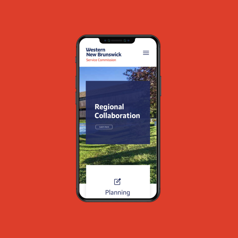
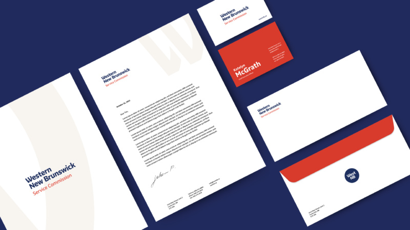
The visual identity is clean and friendly. The wordmark is easy to identify and familiar, while the angled W motif subtly nods to the region’s rivers and New Brunswick’s sail icon. The flexibility is in the simplicity of it. From the core brand to the divisions beneath it, the memorable shorthand to the complete brand system in all its forms.