The Town of Prescott redefined
For decades, Prescott was known as the “Fort Town,” home to Fort Wellington National Historic Site. Today, it’s more than that. It’s a waterfront community on the St. Lawrence River, with pathways and pop-up shops, access to a beach, a thriving arts and culture scene, an arena for sporting events, plus a growing downtown core with live music and great restaurants.
Positioned between Ottawa and Kingston, Prescott has all the ingredients of an exciting tourism destination. To guide that transition, we helped redefine the town through a new brand strategy, messaging framework, and visual identity.
research & insight
Uncovering the essence
We began by reviewing the Town of Prescott’s existing research and brand materials, including Environics and Visitor Centre data, the revitalization strategy, and current brand guidelines. From there, we engaged 30 stakeholders across sectors, from arts and culture to real estate to small business owners and council members, along with additional survey respondents. Four key findings emerged.
vibe
A brand built to be consistent
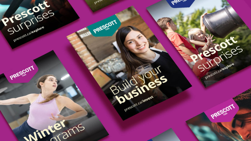
Stakeholders pointed to multiple logos and unclear messaging as key reasons the brand is fragmented. To unite all sectors, from economic development to sports to leisure travel, and create consistency, Prescott needs one distinct identity.
An identity beyond the ‘Fort Town’
The fort is part of the narrative but it’s not the whole story. The brand identity needed to evolve to reflect a well-rounded community that values arts, culture, recreation, business growth, and pride in heritage.
A town in transition
Prescott is transitioning from a traditional working town into a vibrant tourism destination. The brand should capture that energy while staying grounded in the small-town values that define it.
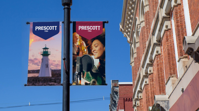
A waterfront lifestyle
Prescott’s waterfront sits at the heart of the town’s identity and future potential. The brand should give it a leading role as a tourism draw and a defining part of local life.

positioning & promise
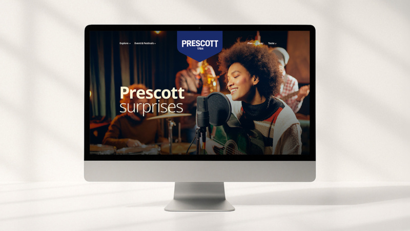
You’re in for a surprise
After speaking with stakeholders and experiencing the town firsthand, one thing was apparent: Prescott surprises you. From how welcoming it is and the ease of doing business there to the sights, shops, and exciting things to do. We positioned the brand around this sentiment. The discoveries, the lifestyle, the potential—it’s unexpected.
Brand pillars
The positioning informed Prescott’s brand pillars that uphold the brand promise and values. Seven key pillars were identified: support, service, shore, spirit, success, sport, and scene.
Brand values
We articulated Prescott’s guiding principles that define its identity. Values such as hospitable, collaborative, and grounded helped identify audience groups and key messaging.
Audience and messaging
We matched traveller types and key messaging to Prescott’s values, pillars, and tourism experiences using the Canadian Tourism Data Collective.


visual identity
From fragmented to flexible
With multiple sectors and audiences to reach, Prescott needed a flexible visual identity that could work across tourism, economic development, and community-facing communications. It had to speak to businesses, residents, and visitors alike while still feeling like one cohesive brand. Just as important, it needed to be modern and forward-looking, while still nodding to the town’s history.