A Modern Identity for Canadian Research
The Social Sciences and Humanities Research Council (SSHRC) funds the ideas, people, and projects that shape Canada’s future. After more than a decade without change, its identity needed to reflect the innovation it supports.
Armed with our expertise leading brand evolutions in complex government sectors, we partnered with SSHRC to modernize its visual identity, making it digital-first and accessible without requiring a full rebrand. We also created distinctive yet connected identities for two flagship programs to help SSHRC’s brand feel as impactful and human as the research it supports.
Client
Social Sciences and Humanities Research Council
Sector
Federal research
Services
research & strategy
Same recognition. Modern refresh.
Our research into SSHRC’s existing identity highlighted both its strengths and room for improvement. While the logo and core motif held strong recognition, the overall system was inaccessible in today’s digital-first world. From this, three strategic priorities emerged:
Preserve legacy recognition
Modernize, don’t replace, familiar elements like the three-line motif and core palette.
Close digital and accessibility gaps
Expand the colour palette and simplify patterns and typography for clarity across digital platforms.
Balance diverse audiences
Create an identity that feels authoritative to researchers and stakeholders yet approachable to students and the public.
creative execution
From familiar to fresh
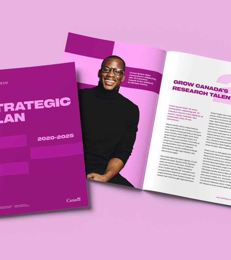
We designed a refreshed visual identity that modernized SSHRC while keeping it firmly connected to its roots. Every choice was made to enhance clarity, accessibility, and impact across the core brand and its flagship programs.
brand

Motif
We reimagined the legacy DNA-style mosaic as a bold, structured bar motif, enhancing clarity and visual impact. Its flexible design adapts seamlessly across digital, social, and print platforms, strengthening brand consistency and recognition.
Typography
We introduced Cy Grotesk, a bold and distinctive display font that adds confident character to the brand while remaining highly legible. For body copy, it’s paired with Source Sans Pro, a clean, accessible typeface that ensures clarity and ease of reading.

Colour palette
We transformed the colour palette into a monochromatic system rooted in SSHRC’s legacy colours. The expanded palette preserves brand familiarity while introducing a fresher, more approachable look. Its high-contrast design enhances accessibility and provides greater flexibility across applications.


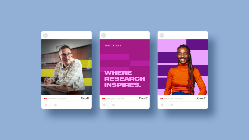
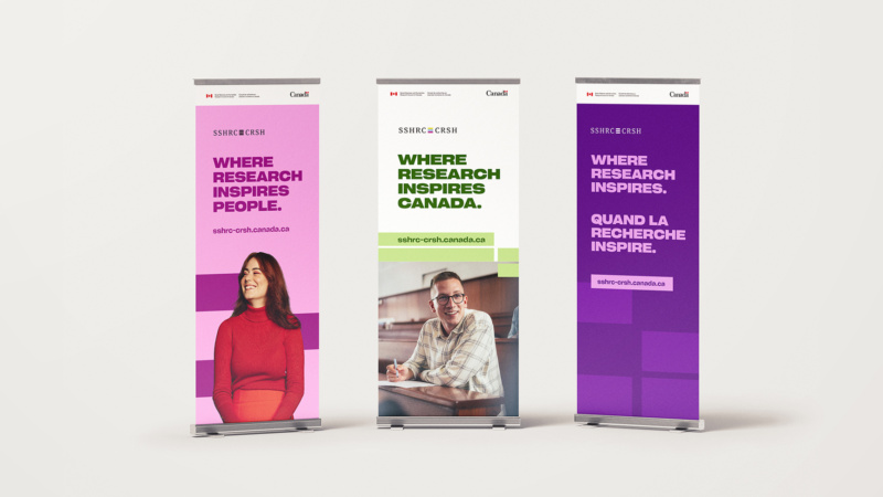
The new brand is accessible, flexible, and human at its core—an identity built for the digital world while honouring SSHRC’s legacy.
SSHRC’s updated identity bridges trusted tradition with modern adaptability. It’s meant to feel as vital and inspiring as the researchers and students at the heart of the brand. From visuals and guidelines to program identities and campaign assets, it proves that refreshing with intention is just as powerful as a full rebrand.

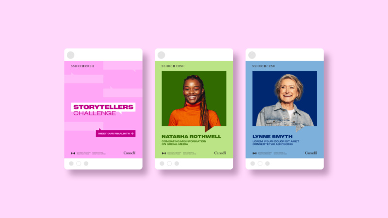
Storytellers Challenge
The Storytellers Challenge invites students to share how SSHRC-funded research impacts everyday life. We gave the program a vibrant, youthful identity that captures student energy and creativity, while keeping it anchored to the overarching SSHRC brand.
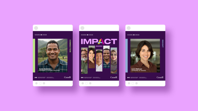
Impact Awards
The Impact Awards celebrate SSHRC-funded researchers whose work transforms Canada’s cultural, social, and economic life. Our refreshed design gave the program a bold, authoritative presence that matches its prestige, while still feeling human and approachable for broader audiences.