Clarity Over Complexity with CDIC
The Canadian Deposit Insurance Company (CDIC) is a federal Crown corporation. They insure eligible deposits at Canadian banking institutions and underpin trust in our country’s financial system. As a brand in a highly regulated, conservative industry, CDIC must appear neutral, credible, and instantly recognizable wherever Canadians encounter it. So when it came time to modernize its visual identity and website, CDIC partnered with Alphabet® to deliver a clear, accessible, and intuitive solution.
Client
Canadian Deposit Insurance Company
Sector
Crown Corporation
visual identity
Distinct by design.
Simple by choice.
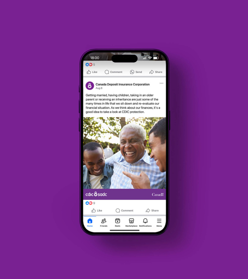
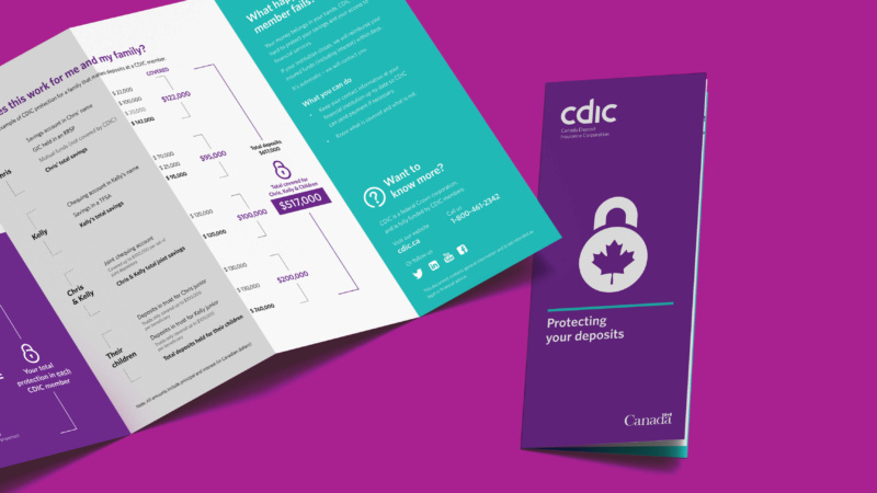
CDIC needed an update to its visual identity that modernized the brand without undermining trust. We focused on clarity and neutrality, avoiding bank-associated colours and visual noise. Through deep desk research and national focus groups, the identity was tested for recognition and credibility. The result is a simple system that works everywhere it's found, from bricks-and-mortar banks and apps to brochure racks and on the web.
brand


Why purple?
We picked purple through an environmental scan, discovering that it’s not used by Canadian banks or many banks globally. It clearly differentiates CDIC while remaining credible, impartial, and appropriate for a national financial institution.
Why cross-country focus groups?
This is the rare case where the audience is everyone, literally. We conducted national focus groups to make sure the identity was understood and trusted across Canada, not just by a single region or audience.
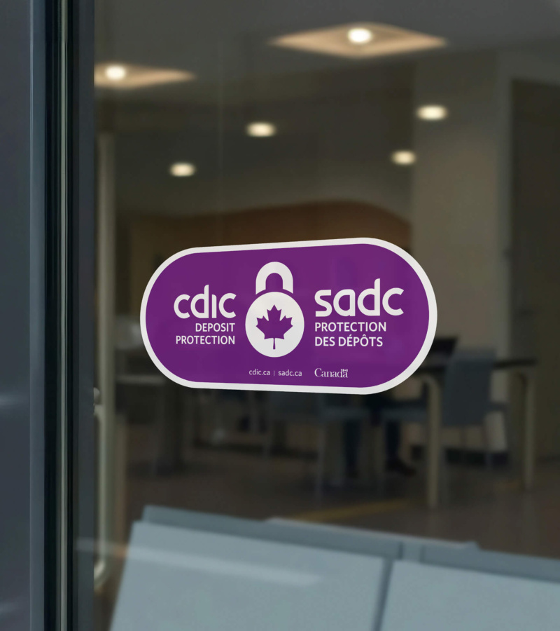
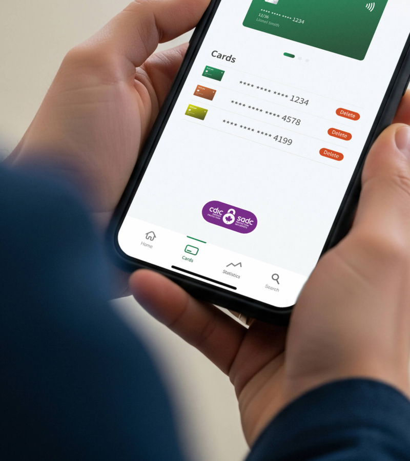
Why a capsule graphic mark?
The capsule surrounds the wordmark and lock logo, acting as a symbol of trust and protection. It’s a clear, repeatable graphic for decals, brochures, online, and banking apps. A visual anchor for credibility and security wherever and however you do your banking.
web development
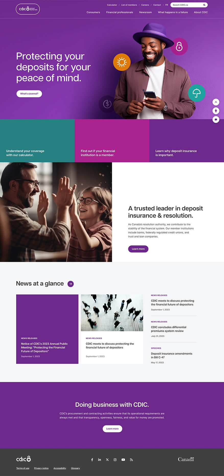
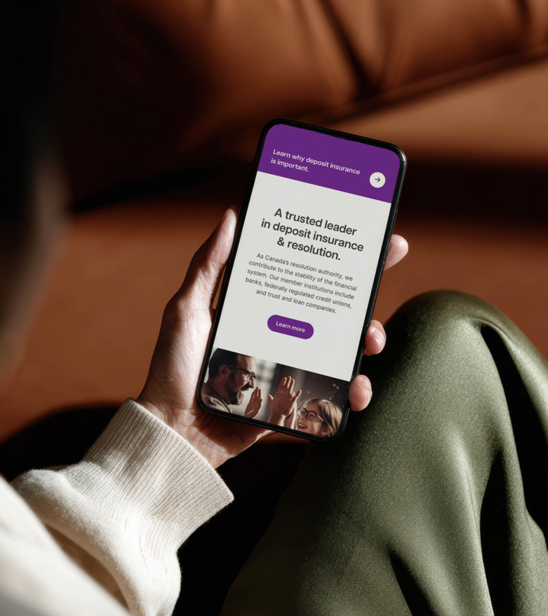
User-first website.
Long-term strategy.
The CDIC website was rebuilt with UI and UX top of mind, prioritizing usability, accessibility, and clarity across an ever-growing digital platform. We simplified the site architecture, improved search, and introduced a consistent design system with iconography to make complex information easier to find and understand.
digital
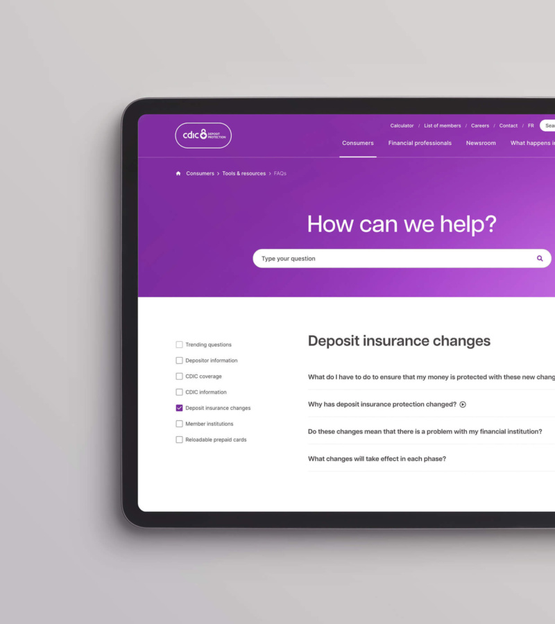
Navigation & architecture
By utilizing mega menus and simplifying the site’s navigation and information architecture, we reduced depth and improved scannability to help users reach key information in fewer steps.
Visibility & search
By making the search function more visible and effective, we helped users quickly locate relevant information without having to navigate deeply or sift through the site’s extensive library of content.
User interface
We created a consistent design system to standardized visual and interactive elements, from buttons to icons to motion. We created the experience to remain cohesive, even as the site evolves.