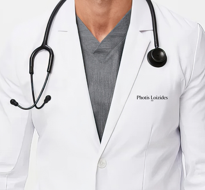
Naturally beautiful. Precisely branded.
When Dr. Photis Loizides relocated from Vancouver to Ottawa, he came to Alphabet® to rebrand his plastic surgery practice. He needed something that reflected the care and precision behind his work. Something that stood apart from the superficial side of cosmetic surgery. So we gave his practice a visual identity influenced by craft, compassion, and respect for real human beauty.
research & insight
Quiet confidence vs. loud vanity
Research showed the industry as polarizing. On one end, there are vanity-driven and over-the-top embellishments. On the other end, there are confidence-inspiring and reconstructive procedures. Most brands are either flashy and glamorous or sterile and clinical. And through it all, we saw an opportunity for Dr. Loizides to communicate expertise without spectacle and balance surgical precision with warmth and quiet confidence.
visual identity
Finding balance in beauty
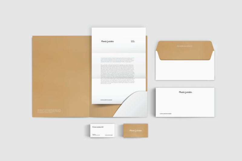
The new identity for Dr. Loizides’ practice is meticulously designed yet intentionally understated, from the wordmark to the visual language. It’s meant to be sophisticated not showy, to feel trustworthy not cold.
A custom-cut wordmark
The wordmark is a refined font we customized to mirror the precision of Dr. Loizides’ work. Every curve, taper, and spacing decision was made with surgeon-like discipline. Visit the blog to learn more about the process and our expertise with typography.
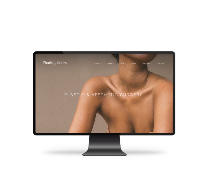
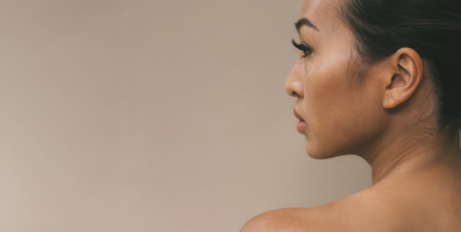
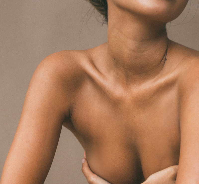
Warm, grounded, human
It’s not high gloss and in your face. It’s not stark or lifeless. It’s inspired by natural beauty. From the colour palette to imagery, the visual identity is meant to feel calm and spa-like, professional yet unpretentious, and human above all else.