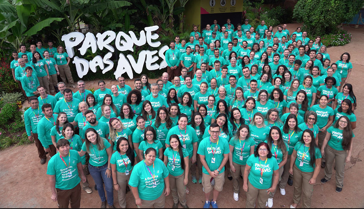
Spreading Our Wings with Parque Das Aves
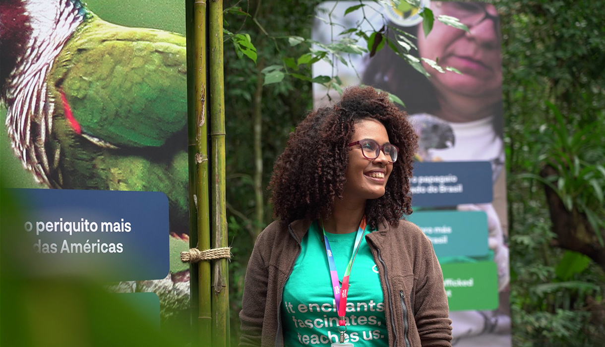
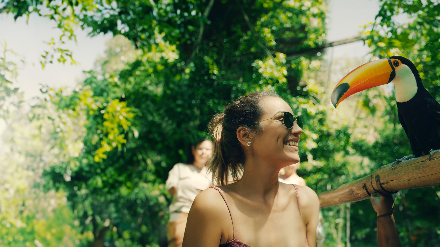
Like the colourful birds nesting in its aviaries, Parque das Aves in Brazil, one of the largest bird parks in Latin America, has an equally colourful mission. Over the years, it has evolved to focus on studying, breeding, and, ultimately, protecting more than 75 species of birds from extinction within the Atlantic Rainforest. But to the crowds of tourists who have flocked to its gates for decades, the park has traditionally been marketed as a zoo.
Alphabet® partnered with global tourism consultancy Twenty31 to help Parque das Aves uncover the truth of its brand. By helping the park re-envision its purpose as a conservation centre, we ensured Parque das Aves could connect to its visitors on a deeper, more meaningful level.
Doing it for the birds. Literally.
While wildlife conservation may not be as top of mind in Brazil as it is in other countries, as experts in tourism marketing, we know that consumers and travellers value brands that impact positive change – and our research for Parque das Aves echoed this insight.
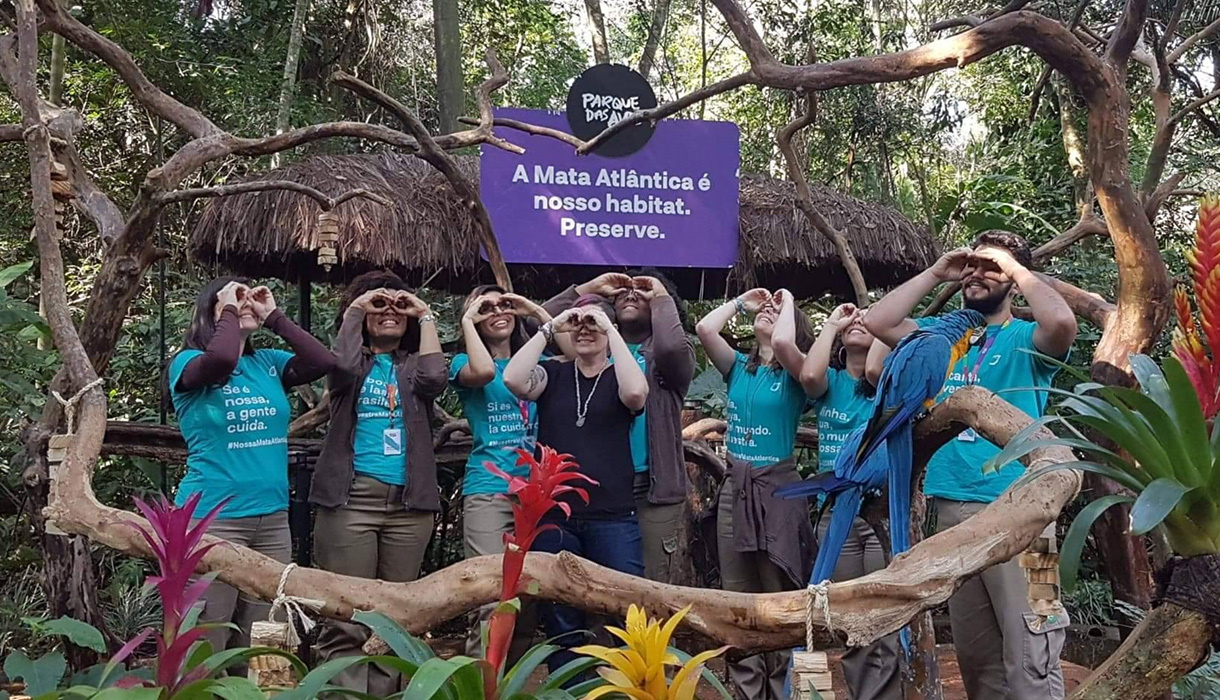
We conducted a detailed review of the park’s current brand and audience as well as internal and external stakeholder interviews. From there, we harnessed our research to develop a platform that broadcasts the park’s passion for advocacy – one rainforest, shared by all.
nossa
Nossa Mata Atlântica
From Our Atlantic Rainforest
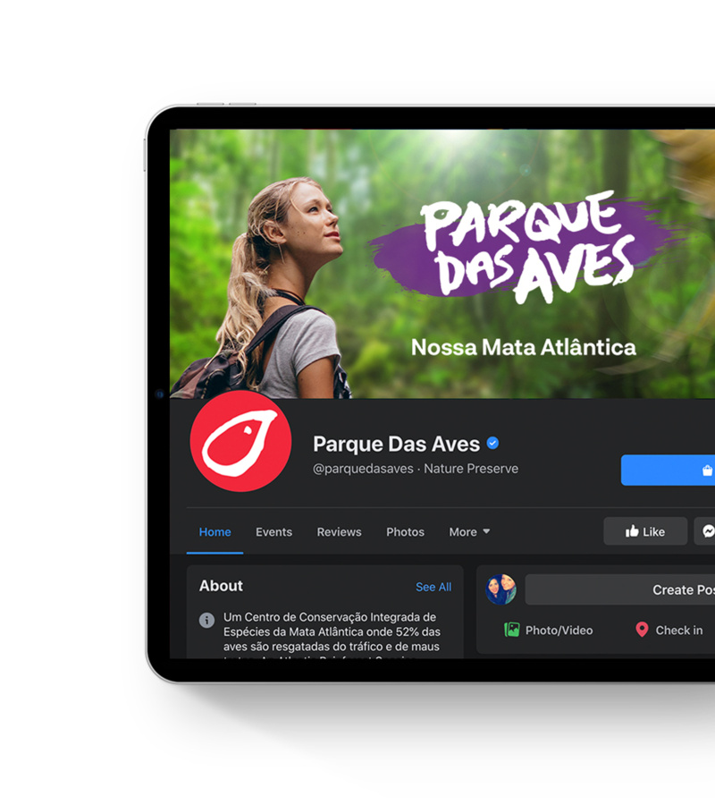
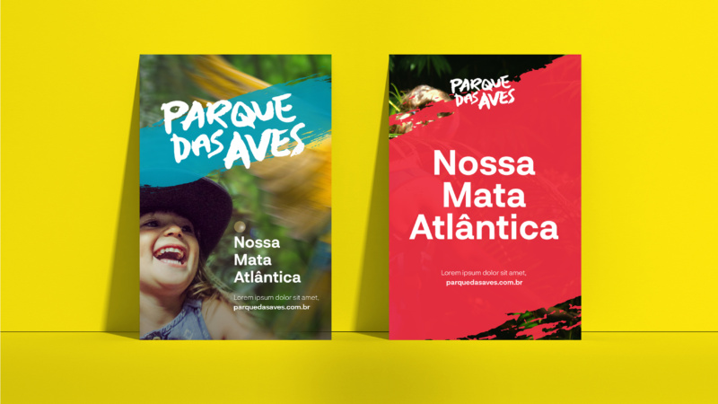
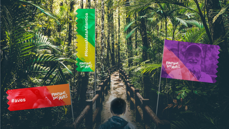
Creating a movement.
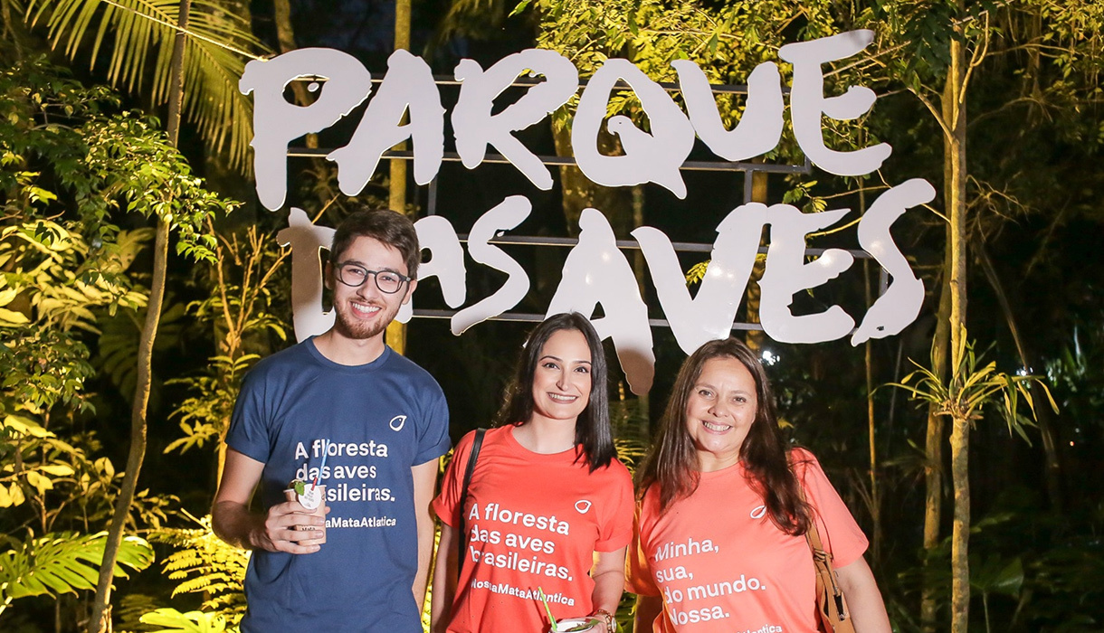
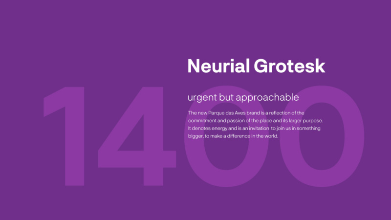
In addition to a new positioning and messaging foundation, we gave Parque des Aves a visual identity that brought it all together. Using a combination of raw, hand-written lettering and bold brush strokes, we created an aesthetic that’s more like a movement than a zoo – a rallying cry to support a cause.

But we didn’t overlook nature.
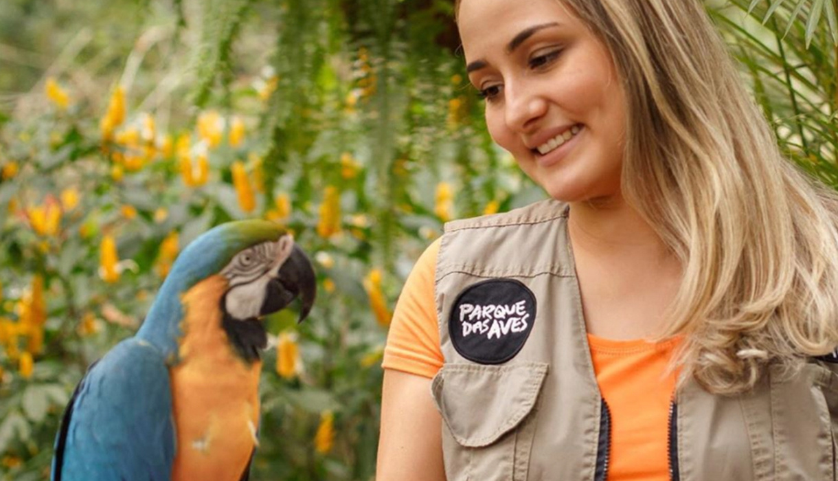
Both Parque das Aves’ new logo and colour palette draw inspiration from the birds it so diligently works to preserve.
A strong perch to stand on.
By deploying Alphabet’s three-stage branding process, we helped Parque das Aves not only affirm who they are and why they’re relevant, but we gave them a foundation to articulate their story (and the birds’) with confidence. And, since launching the new brand, the park has already increased its visitors, meaning more revenue and a better future for at-risk wildlife.
“We're delighted with how easy the brand design makes everything. It feels harmonic and natural, but strong – exactly the qualities we want to leverage.”
Carmel Croukamp, CEO, Parque das Aves